1. jQuery 라이브러리 활용 방법
http://detectmobilebrowsers.com/ 에서 모바일 기기를 감지하고 소스를 다운받는다.
사이트에 접속하여 jquery 버튼을 클릭하여 소스를 다운로드 한다.
detectmobilebrowsers.com
jQuery 소스를 다운받고 아래와 같이 작성해본다.
<!DOCTYPE html>
<html>
<body>

<h1>Mobile test</h1>
<script src="http://code.jquery.com/jquery-3.3.1.min.js"></script>
<script src="detectmobilebrowser.js"></script>
<script>
 console.log(jQuery.browser.mobile);
 alert(jQuery.browser.mobile);
</script>

</body>
</html>
해당 파일을 저장하고 브라우저에서 콘솔화면을 확인하면 false가 나오고 경고창으로 아래와 같이 나온다.
console.log
호스팅 서버에 올리고 모바일 기기에서 확인해보면 아래와 같이 true로 값이 경고창으로 나온다.
if 조건문을 작성하여 jQuery.browser.mobile 의 값이 true 일때와 false 일때 효과등을 다르게 작성할 수 있게 되겠다.
그러면 아래와 같이 모바일 기기일때 나타날 요소를 구분할 수 있겠다.
<script>
 //console.log(jQuery.browser.mobile);
 //alert(jQuery.browser.mobile);
  if(jQuery.browser.mobile == true){
		$('.pc').css({display:'none'});
  } else {
		$('.mobile').css({display:'none'});
  }
</script>
또는 모바일 기기로 접속했다면 별도의 모바일 전용 페이지 로 이동시킬수도 있다.
<script>
if(jQuery.browser.mobile == true){
location.href="./mobile/";
}
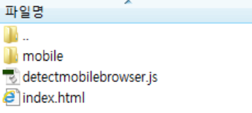
</script>참고로 디렉토리 구조는 아래와 같다.
2. javascript - userAgent 방식
javascript에서 브라우저(userAgent)를 구분하는 방식을 이용하여 아래와 같이 작성하여 모바일이라면 특정 폴더 및 파일로 연결할 수 있다.
/**
* 모바일 페이지 강제 이동
*/
//Mobile여부를 구분하기 위함
var uAgent = navigator.userAgent.toLowerCase();
// 아래는 모바일 장치들의 모바일 페이지 접속을위한 스크립트
var mobilePhones = new Array('iphone', 'ipod', 'ipad', 'android', 'blackberry', 'windows ce','nokia', 'webos', 'opera mini', 'sonyericsson', 'opera mobi', 'iemobile');
for (var i = 0; i < mobilePhones.length; i++){
  if (uAgent.indexOf(mobilePhones[i]) != -1){
    location.href="/mobile/home/main.do";
  }
};
3. Modernizr 활용하기
https://modernizr.com/
Modernizr: the feature detection library for HTML5/CSS3
What is Modernizr? It’s a collection of superfast tests – or “detects” as we like to call them – which run as your web page loads, then you can use the results to tailor the experience to the user.
modernizr.com
브라우저에서 어떤 기능들을 지원하고 지원하지 못하는지 구분하여 html 최상단에 class명으로 구분하여 주는 modernizr를 활용하여 모바일 기기를 구분할 수 있다. 특히 속성중. touch 이벤트의 지원 여부를 구분하면 된다.
CSS
.no-touchevents .box { color: red; }
.touchevents .box { color: green; }


JS
if (Modernizr.touchevents) {
  // supported
} else {
  // not-supported
}
지원하지 않는 다면 클래스명 .no-touchevents라는 이름이 html 태그에 추가되어 구분할 수 있게 도와준다.
스크립트로는 Modernizr.touchevents의 값이 true, flase일때 구분하여 스크립트를 작성하면 된다.
모더나이저를 사용하기 위해서는 html에서 script 소스를 아래와 같이 로드해야 한다.
<script src="https://cdnjs.cloudflare.com/ajax/libs/modernizr/2.8.3/modernizr.js" integrity="sha256-ffw+9zwShMev88XNrDgS0hLIuJkDfXhgyLogod77mn8=" crossorigin="anonymous"></script>
4. vanila javascript - window.devicePixelRatio
순수한 자바스크립트를 이용하여 구분하는 방법으로 기기의 픽셀 레티오로 모바일 기기를 구분할 수 있다. 모바일 기기들은 pc와 다르게 작은 화면에 2배 또는 4배의 픽셀을 담고 있다.
각 디바이스의 픽셀 레티오는 아래 사이트를 참고한다.
http://troy.labs.daum.net/
불러오는 중입니다...
스크립트에서 아래와 같이 입력하여 pixel ratio가 2이상이면 즉 모바일 기기이면 다른 효과 및 페이지 이동을 할 수 있게 된다.
	var ratio = window.devicePixelRatio;

	if(ratio > 1){
		window.location.href = 'mobile-home.html';
	}